Supply and demand graph template
Created by:

Turn raw market data into actionable insights representing pricing trends and market dynamics.
Categories
- Finance & Ops
- Project Management
- Whiteboard Template
KEY FEATURES
Reporting
Business Updates
Knowledge Base
Looking at market trends can feel overwhelming, especially when making sense of raw data. Supply and demand graphics turn complex market information into something you can see and understand. Whether figuring out pricing strategies or explaining market shifts to your team, these visual tools make your job much easier.
Confluence whiteboards offer an intuitive way to bring these visuals to life. With real-time collaboration and easy-to-use drawing tools, you can quickly create professional supply and demand graphs to share with your team. By working in a shared space, everyone can contribute to and stay aligned on key market insights.
What is supply and demand template?
Supply and demand is the relationship between producers and consumers in any market. When discussing demand, we look at how much of a product or service customers want at different price points. Supply shows us how much sellers will provide at those same price points.
Simply put, it's about finding the sweet spot between what purchasers want and what sellers can offer. Together, these two elements tell the story of how markets work.
These forces don't exist in isolation—they constantly interact and respond to each other. Prices typically rise when demand increases and supply stays the same. When supply increases, but demand remains steady, prices tend to fall. Understanding these patterns helps businesses make better pricing, production, and market strategy decisions.
What is a supply and demand graph template?
A supply and demand graph template helps you visualize these market forces. It can become your go-to framework for plotting out market behavior. Using a supply and demand graph template gives you a reliable structure for showing how prices and quantities relate to each other in your market.
It can also help you plot supply and demand curves, making it easier to spot trends, predict market changes, and communicate insights to your team. This diagram is helpful when analyzing different scenarios or tracking changes over time.
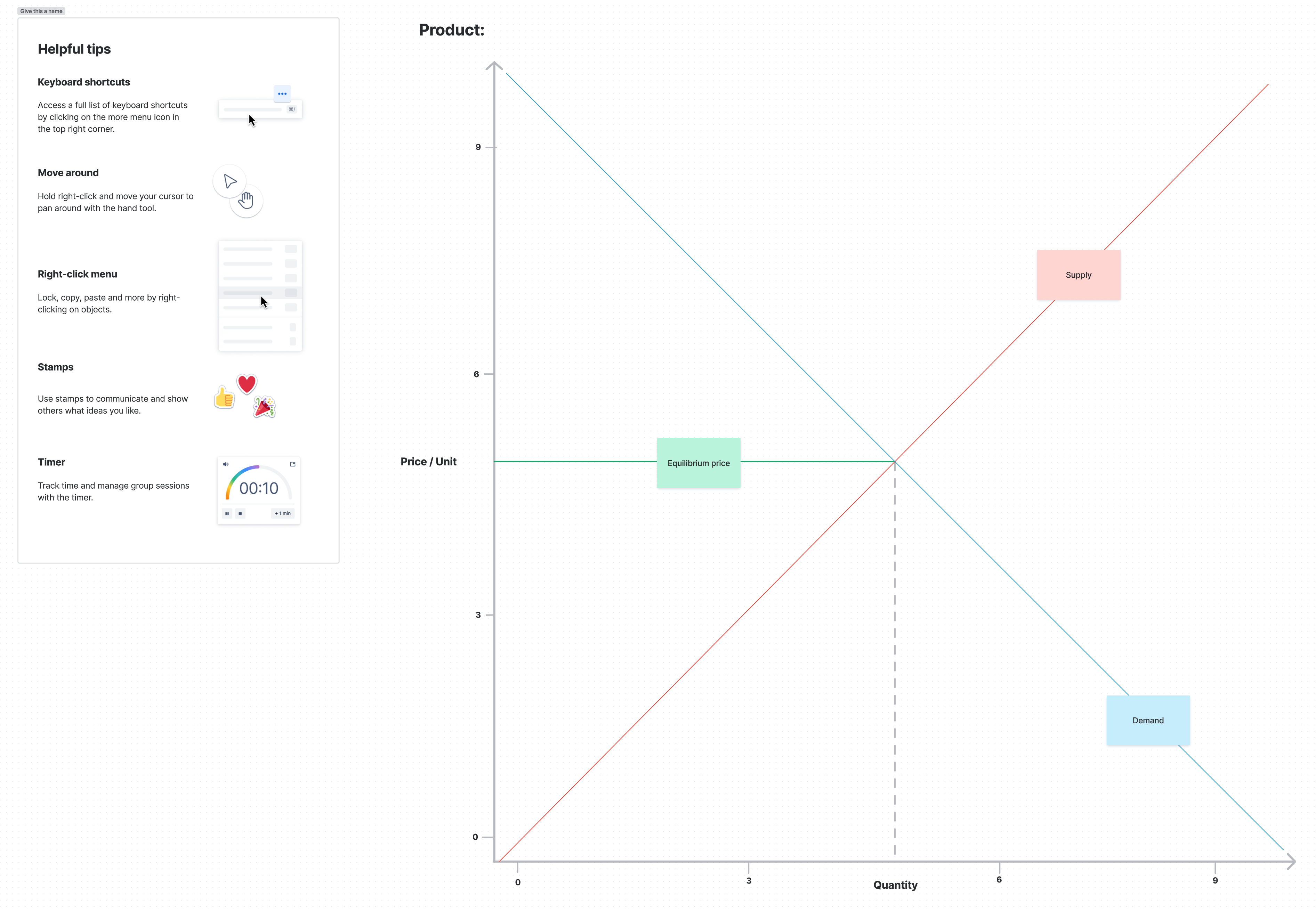
Elements of a supply and demand graph template
A supply and demand graph consists of five key elements that help tell your market's story:
Price axis: The vertical line on your graph shows different price points for your product or service. This helps you track how prices change as market conditions shift.
Quantity axis: The horizontal line represents the amount of your product or service. It lets you measure how much is bought and sold at various price points.
Supply curve: This upward-sloping line shows how much sellers will produce at different prices. As prices increase, sellers typically want to supply more, so the line slopes up from left to right.
Demand curve: Running downward from left to right, this line shows how much buyers want at different prices. People usually buy less when prices rise, so the line slopes downward.
Equilibrium: This is where your supply and demand curves cross. It shows the "perfect match" price point where the amount sellers want to sell equals the amount buyers want to buy. This sweet spot helps you understand your market's price and quantity levels.
Why use a supply and demand graph template
A supply and demand graph template helps you create market analysis quickly and accurately. Here's why it works:
Faster creation and updates: Instead of drawing axes and plotting points from zero every time, you can add your data. This means less time setting up and more time analyzing what your market is doing.
Better consistency across reports: Your market analysis looks professional and stays consistent when everyone uses the same template. This approach strengthens project collaboration and makes comparing data across different periods or market segments easier, supporting consistent work management practices.
Reduced chance of errors: With pre-set axes and clear guidelines for plotting points, you're less likely to make mistakes that could throw off your whole analysis. The template keeps you on track.
Best practices for creating a supply and demand graph
Follow these tips to develop effective supply and demand graphs:
Choose the correct scale: Pick scales that make your data easy to read and understand. Too large or small a scale can hide important market patterns or make your graph harder to interpret.
Make labels clear: Every point and axis needs a label. This includes units of measurement, price points, quantities, and any key market events that might affect your curves.
Use consistent styling: Keep your line styles consistent throughout your graph. Different colors for supply and demand curves make them recognizable and easier to track.
Keep data current: Update your graphs regularly with fresh market data. Old data can lead to misleading conclusions about current market conditions.
Benefits of using a supply and demand graph template
Simplifies data visualization
Complex market data is much more digestible when presented visually. A supply and demand graph template helps you organize and present information in a way that's easy to understand, even for team members who might not have economic backgrounds. This clarity is essential for strategic planning, project scope, and communication.
Enhances decision-making
Making informed decisions becomes much easier when market trends are clearly presented. Supply and demand graphs help stakeholders quickly grasp market dynamics, promoting better decision-making.
Pair your market analysis with Confluence's DACI template to document your reasoning and align your team on market strategy and next steps.
Improves market analysis
Templates help you consistently track and analyze market changes over time. By regularly plotting your supply and demand data, you can spot emerging trends and react quickly to market shifts.
For a complete view of your market position, combine your supply and demand analysis with Confluence's competitive analysis template to track how your market trends stack up against competitors.
Saves time
Starting with a template means you don't have to start from scratch each time you analyze market data. This efficiency is especially valuable for project planning, producing regular market reports, or updating your analysis quickly with new data.
Increases accuracy
Using a template reduces the risk of errors in your market analysis. With pre-set axes and clear guidelines for plotting curves, you're less likely to make mistakes that could affect your conclusions. This accuracy is crucial when integrating market data into your work management solution and supporting effective project management.
How to create a supply and demand graph template
- 1
Plot supply data
Plot your supply data points. Remember that supply curves typically slope upward from left to right, showing producers are willing to supply more at higher prices. Mark each data point.
- 2
Plot demand data
Next, plot your demand data points. The demand curve usually slopes downward from left to right, reflecting that consumers buy less as prices increase.
- 3
Identify the equilibrium
Look for where your supply and demand curves intersect. This point represents market equilibrium — where supply equals demand at a specific price point.
- 4
Draw the curves
Connect your plotted points with smooth, precise lines. These curves should flow naturally through your data points without sharp angles or breaks.
- 5
Mark key points
Label essential points on your graph, especially the equilibrium point. Include the equilibrium price and quantity values for easy reference.
- 6
Analyze the graph
Study how changes in market conditions might shift either curve and affect the equilibrium. This analysis helps predict market responses to various factors.
Remember to use the collaborative and user-friendly features of Confluence whiteboards when creating your supply and demand graph template. Capture free-flowing thoughts and ideas that can be easily organized and transformed into actionable steps.
Create a supply and demand graph with Confluence whiteboards
Confluence offers a collaborative space for creating and sharing supply and demand graphs with your team. With Confluence whiteboards, you get intuitive drawing tools that make it easy to plot curves, add labels, and adjust your graphs in real-time. Plus, since everything lives in Confluence, your team can access and update these visualizations whenever needed.
Building a collaborative culture is easy when everyone works in the same space. You can collaborate with Confluence to keep your market analysis up to date and ensure your team stays aligned on market insights.
Related templates

Project Management
Product roadmap template
Map a strategic business path for your team in line with organizational goals.
Project Management
Business Proposal Template
Build winning business proposals using Confluence templates. Streamline collaboration and get stakeholder buy-in faster.

Teamwork
Capacity planning template
Take the guess work out of your estimation and prioritization.